The 9 Hottest Web Design Trends For 2019 You Can’t Ignore
These are web design trends focused on small businesses looking to generate more traffic and customers for their website.
In this article, I’m going to share with you my 9 web design trends in 2019.
I’m Victor Thomas, the founder of Thomas Digital, the place where small businesses go to get beautifully designed, custom WordPress websites that rank well on Google.
And before we dive in here, I want to give you a word of warning.
If you look around, you’ll see a lot of web design trends articles out there that all pretty much say the same thing.
They talk about things like vibrant colors, micro-interactions, chatbots, and custom illustrations.
Here’s the problem with that.
If everyone is already talking about it, then it’s not really this year’s trend, it’s last year’s trend, and everyone is already doing it.
But worse than that, most web design trends are focused on the wrong thing, which are superficial elements relating to the ‘how’ of design, e.g., font, colors and animations and they’re not focused on the ‘what’ of design, which is understanding your visitors’ needs and how it relates to your offerings.
So, these are not trends you will probably see anywhere else because they come directly from our working with hundreds of small businesses and spotting the web design trends that are working for them.
So, without further ado, here are my 9 web design trends for 2019.
Be sure to watch out for #5 because it’s the exact opposite of what most people are doing.
1. Self Identification Design
The way I like to think of a website is there is a person who is looking for something, and there is a next step they want to take.
And my job as the web designer is to identify these different people and what it is they are looking for.
The challenge is there is usually more than one type of person coming to your website who want different things.
For example, on a non-profit website, there are those looking to give money, those looking to get money, people looking to volunteer and others looking to attend the events held by the non-profit.
The key to good design is to identify who those different users are and design the site in such a way that users can self-identify to more quickly get to where it is they need to go.
The simplest way to do is to have actually section on your site that calls out to the different user types directly.
Here’s what I mean…
Don’t tell anyone, but the internet = advertising.
Everything you see on the internet is an advertisement that is meant to grab a user’s attention and direct them somewhere else.
And your website is just a series of advertisements to the various pieces of content you have on your site.
Most ‘advertisements’ you see on a website have to do with the content, such as here are our services, or here is our company history.
So when you see a paragraph section on the home about that talks a little bit about the company and then has a link that says ‘read more.’
The way I think about it is that’s really just an advertisement for your about page.
So Self Identification Design is the exact same thing, except instead of calling out your text, you are calling out the various user types who come to your site.
2. ADD Design
In their seminal book, ‘Positioning’ Al Reiss and Jack Trout said that we are living in our first overcommunicated society.
The kicker, they wrote this in 1980.
It’s no secret that people these days have the attention span of Dory the blowfish.
I’m, sorry what were we talking about? Oh yeah! Web Design Trends!
And because of this, you want to set up your design in such a way that your design and content require the minimal amount of attention needed by your visitor.
Here’s the idea…
Usually when someone is on a website that has a particular thing they are looking for.
To make this easy for your visitor you want to make your content and design as skimmable as possible.
I like to joke that everyone these days has ADD and can’t read.
So to compensate for that we like to create a very visual design that has pictures, icons or illustrations that easily identify what each section is about.
This way, the user can quickly skim through to find the thing they are looking for and drill deeper from there.
So here are some ways you incorporate ADD Design.
Reduce the amount of visible text on the page.
If people want to read more, let them access that text content through pop-ups, accordions or directing them to other pages.
Make your design highly visual.
But don’t confuse.
Make each idea or section on your website clear, simple and focused on one idea.
Avoid ambiguity or even cleverness.
If a 5-year-old can’t understand what a section is about just by looking at it, you’re probably doing it wrong. This one of the web design trends that allows visitors to go through your website fast and understand the message intended.
3. The Content Kondo
In Marie Kondo’s bestselling book, “The Life-Changing Magic of Tidying Up” she coins a phrase of ‘Kondoing’ your closet.
What you do is you take every single piece of clothing out of your closet, go through each article of clothing, hold it to your heart and ask yourself if it gives you a spark of joy.
The key to the method is you only keep that which is essential and dispose of the irrelevant.
A Content Kondo is basically the same thing, but with your website content.
What you do is hop on over to Google Analytics and take a look at your most viewed pages.
Delete all of your least viewed pages.
I’m talking to you sad Resources page with only 5 links on it.
And you too Press page that hasn’t been updated since 2015.
Get rid of them.
Even your least trafficked blog posts. Toss them.
You might not realize this…
But deleting useless pages can actually help with your Google Ranking.
It concentrates the ‘Google Juice’ of your website on the pages that actually count.
One word of warning
Be sure to setup 301 redirects all pages with backlinks pointing to them.
Another thing you can do is consolidate your content.
Maybe you don’t need to have separate about, team, company history, and philosophy pages.
Take the most important elements from each of those pages and consolidate them into a single about page.
As with most of the tips here, it’s all about maximizing visitor attention. If your website has many pages that are not visited or have fewer visitors, this is one of the web design trends that can work for you.
4. Visual Storytelling
You might think this was already covered in the ADD Design tip, but it wasn’t.
Visual storytelling is one of the website trends that is not about reducing your website’s text in favor of imagery.
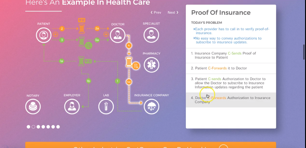
Instead, it is about taking something that your company does which can be confusing and abstract and turning it into a visual story which can be clear and simple for your visitors to understand.
Here’s how this works…
All good stories have just three elements to them, a beginning, a middle and an end.
What you want to do is use the language of design to take visitors from their current situation, the beginning
to their desired outcome, the end.
And just like any good story you need a hero, which is your product or service.
Some examples of thing are action can be a before an after swipe bar
an interactive diagram
animated gifs
or even edited videos
The key is, it’s not about the technology, e.g., SVG animations or jquery libraries, it’s about having a purpose and telling a story that’s where so many websites go wrong they get all excited about a new technology, the ‘how’ of design but they lose sight of the ‘what’.
5. Marketing First Design
There’s a big debate among website designers. Should it be design first? Or content first? Or maybe mobile first?
Which of those are right?
Well, in my opinion, they all have it wrong.
To me, the purpose of a website is to make money. And in order to do that the right strategy is Marketing First Design.
What do I mean?
Most people are focused on getting their name out there, rather than getting their prospects name
into their list. The truth is according to Episerver 92% of website visitors aren’t ready to buy right away.
So what do you do with all of these missed opportunities?
That’s where marketing first design comes in.
You want to turn your site into a lead capturing machine here are some ways you can do that
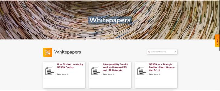
a newsletter signup form gated content which can be accessed by sharing an email address.
A whitepaper or downloadable pdf, a pricing page which is only viewable in exchange for an email address.
A quiz or survey, any type of automated quote or calculator.
Chat software or chatbots, pop-away forms which offer discounts or coupons.
Then once you have the visitor’s email address you can continue marketing to them via your email newsletter
you do have an email newsletter, don’t you?
6. Google Lockdown
This is one of the web design trends that seem not important but is crucial as far as ranking on the search engine is concerned. If you care about ranking well in Google, you need to make sure your website is https secure.
If it’s not, Google will actually penalize you by lowering your ranking on the search results.
To make sure your site is https secure, you need to buy what’s called an SSL certificate.
You then need to have this certificate configured to your site, which can be a little tricky, so hire a professional for this one.
You’ll know your site is https secure when you see a little padlock next to your URL in the browser.
7. The Slowpoke Tax
If you care about ranking on Google, then this is one of the web design trends to adopt. Not only will Google penalize you in the search results if your site is not secure but also if it is too slow.
With Google, it’s all about improving the user experience.
And since users are in such a rush, they just don’t have the patience to sit around and wait for a slow website to load.
A good rule of thumb is to have your site load in under 3 seconds. 2 seconds and under is even better. But with all those animations people have these days sometimes that’s a little tough.
Also, don’t just check your desktop speed.
Mobile speed is super important when it comes to ranking on Google.
So make sure your mobile site is optimized for speed.
8. WordPress Gutenberg
WordPress powers over 30% of all websites on the web and lately they have released a huge update to their platform.
If you haven’t heard of it, it’s called Gutenberg and its a visual editor which is changing the game on how websites get edited on the backend.
This also comes as a bit of a warning because the Gutenberg update is completely messing with how all previous WordPress websites were developed.
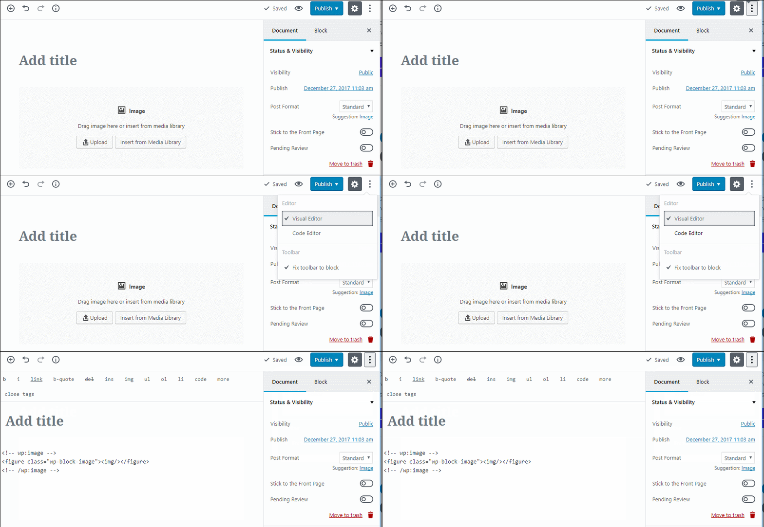
Especially if they were using plugins such as Advanced Custom Fields or Visual Composer.
The takeaway, be sure to test, to make sure your theme is compatible with WordPress 5.0 which has Gutenberg.
Otherwise, you may have some unwanted fires to put out.
9. The Big Ass Footer
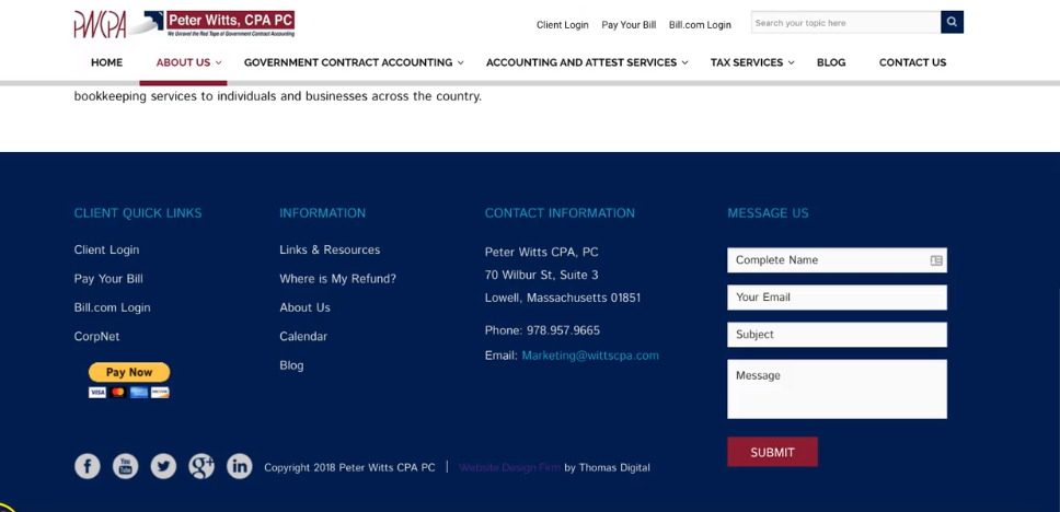
Most of the web design trends mentioned in this video relate to the user’s attention span, and this is no exception.
I’ve found that different visitors tend to interact with websites in different ways.
Some people like looking at pictures.
Some people like reading through the text.
While others like to watch videos.
But there is definitely a group of visitors who just want to see everything available on a website Craigslist-style.
And the Big Ass Footer is for those people.
And just as the name suggests, it’s just a really big footer.
Good website design is a careful balance of catering to your visitor’s need and the business’s need.
And the Big Ass Footer allow visitors to choose their own adventure when coming to your site and interacting with it the way they want to.
Conclusion: Web Design Trends 2019
There you have it, my 9 web design trends for 2019.
Now I want to turn it over to you.
Which of the 9 web design trends are you going to implement in your next website project?
Marketing First Design or The Content Kondo?
Let me know by leaving a quick comment right now.

