5 Marketing Design Ideas to Increase Conversions on Your Website
The main goal of your marketing design should be in line with your business products and services to potential clients who need them. The purpose of a marketing design is to educate and convert visitors.In this article, we will talk about two of my favorite subjects which are marketing and design. We will see how specifically your design affects your marketing and how your marketing affects your design. let’s get right into it.
How Marketing Affects your Design
1. Create a Compelling Offer
I notice that many people when I visit their websites that they do not have a compelling offer. There’s really nothing there for you to do and no kind of clear next step.
I will help you understand this by using Dean Jackson’s analogy. Imagine you were coming over to my house and you sit down in my living room. I ask you to make yourself comfortable.
There is plenty of food in the fridge if you are hungry. Could you fix yourself something to eat putting in mind you were told to make yourself at home? What are the odds that you would walk into my kitchen open my fridge and just help yourself to make a sandwich? Probably, this will be somehow not good.
Right?
Everyone tends to respect someone else’s space, and no one wants to intrude.
Similarly, If you visited my house and I told you that I knew you were to visit and I just baked a fresh plate of cookies. I then hand over to you the freshly baked cookies and request you to grab a piece.
Well, this is a totally different scenario. In the second case, it would be difficult for you not to accept the cookies regardless if you are hungry or not.
This is what a lot of people do with their websites. They present their website just like in the first scenario by essentially providing the website name, rank and serial number. Also, they will go ahead and claim ownership of the website and present their contact information without a clear and compelling next step for their visitors.
They do not give an offer for their visitors to take. Their visitors are only given contact details to reach the business owner if they needed more information. This is just equivalent to helping yourself in the fridge if you were hungry.
Here’s an example of a cookie offer, where a company basecamp offers project management services. The company offers an offer where visitors will use the base camp for two months for free. The offer gives the users for unlimited free trial, no obligation or credit card information is required.
So, what are they doing?
They’re offering you a cookie. They have put together the offer for free, and it is meant for anyone who wants to try out. There is no obligation, and it’s free for anyone to try. By doing this, they are giving something compelling for trial. This shows that having no clear offer can affect your marketing design.
Here is another example of project management software. Their headline is ‘project management software that makes your life easier.’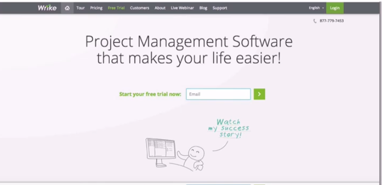
So, Do we have a cookie here?
This is a good example of an offer, but it does not have something specially made for its visitors to try out.
Here is another example of a project management software that has been perfected through 10 years of real-world use.
Who really cares?
Nobody is interested in you. It’s not about something you can do. It is just like you are trying to show you are awesome.
Let us look at one shocking example, eBay where we have tones of items displayed. They guess the great picks to offer to their buyers. Also, they offer free shipping, iPods, computers, ipads or give you specific items that you might be interested in right then and there. We can say that this is equivalent to offering you a cookie.
2. Be Specific
Most people are not specific about what they are talking about. They vaguely talk about things. Here is an example to help you understand. When Steve Jobs introduced an iPod for the first time, he did not say ‘a device has 10 gigabytes or awesome device’, but he referred it to a device that could hold 10,000 songs in your pocket. He was trying to communicate to people something more specific and tangible rather than being clever and ending up with a catchy phrase.
It is therefore important to be clear and specific as much as possible providing your visitors with something more specific.
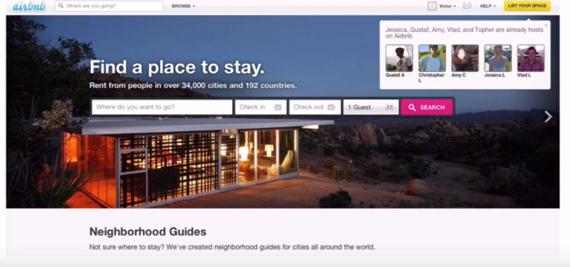
For example; when you visit Airbnb website, their headline is specific and has a tangible number -Rent from people in 34000 cities and 192 countries.
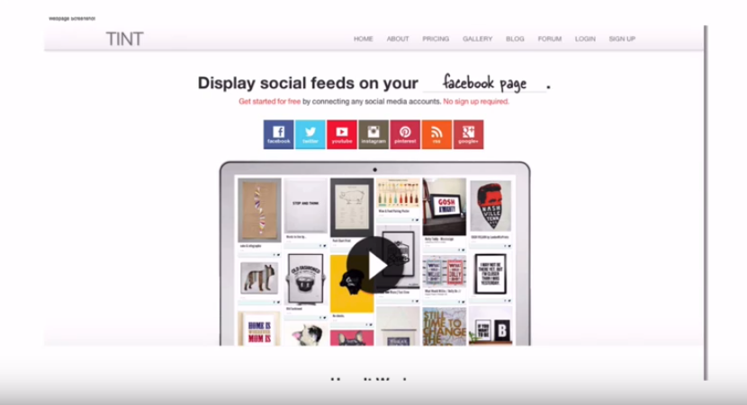
You could also use a website company known as Tint that displays social feeds on your website.
Take a look at the screenshot of the website below. The website looks good, and nothing is wrong with it. But, it says ‘effortlessly organize your purchasing.
What does that mean? Can you have a clue of what the company does?
Well, the answer is no! It is not specific.
Actually, it is a software as a service company for accounts payable people, but that is not obvious it is exactly what it by looking at it.
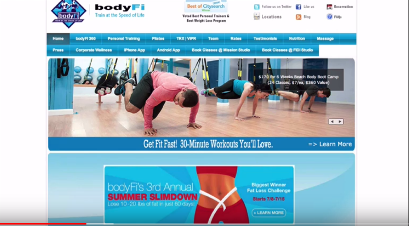
You should ask yourself what your website is about. Is it about you? Here is an example of a fitness company. This website is about the owner.
Is your website about the customers’ needs?
Here is another fitness company website that is totally different from the above one. Visitors here will get 30 minutes of workouts. So, this website is about the visitors and 30 minutes workout rather than just about the owner.
3. Move with Free Line
Here is a concept from Evan Pagan you should embrace is moving the free line. Basically, the concept is that because everything is digital these days, it is therefore so easy to produce quality content. Be it video, audio, book, applications, quizzes, etc. You can, therefore, create a lot of value and give it away for free as a marketing tool for your website.
Another great example is a website called SEO Book. The owner of the website paid around 5,000 dollars about 10-15 years ago for someone to develop a SEO plug-in. The plug-in would show other website owners information like backlinks and other useful SEO information. He then put it on his site for visitors to download it for free. He gave it away to the world free.
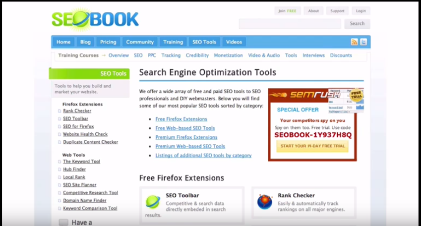
The outcome was great. People started linking back to his site because of the awesome tool that was free. He got the free backlinks, and his SEO rank rose like crazy. This tactic made him get a lot of free new customers because they were using his tool. This was successful by using or moving the free line.
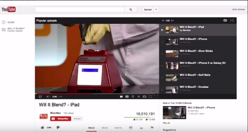
Here is another example of ‘will it blend’ YouTube series. In this series, they blend iPhone and iPads and other kind of fun things. As you see from this particular video alone got 16 million views just for blending one iPad which is about 300 bucks.
So, was it worth the price?
Here is one of my favorite examples where a guy was selling guitar string on eBay at a cost. You can use this example for your marketing design ideas. Let us say the guitar string cost like 10 dollars each. The guy was selling like $3 each. He definitely was not making any profit on his sales.
Someone went ahead and bought the guitar string to see what the guy was up to. After two days the guy emailed the buyer just to say thanks. He then showed the customer a list of awesome guitars that he had for sale. These were like 5, $10,000 guitars.
So, what had the guy done?
For the cost of the guitar string that was nothing since he was getting his money back and also a free list of guitar buyers. This is what is known as self-liquidating offer where the guitar seller was able to get free leads.
4. Make a Mafia Offer
This leads us to another concept. Let us look at Dean Jackson concept again which is to make a mafia offer. Here, you make someone an offer which they cannot refuse. The offer should be so compelling that visitors cannot resist when you give them on your website.
Here are some examples of mafia offers.
1. Gift with Purchase
One of them is a gift with purchase which was invented in the 1950s by Estee Lauder. They invented the idea of getting an extra little gift after making a purchase. They even later changed it to gift with a visit. Meaning, visit a website, get a gift and you can still go ahead and buy something.
2.Free trial
Let’s go back to the base camp once more. The website offers two months using their service for free. If the users like it, they can go ahead and pay for it. This gives an opportunity for users interested in the project management software to give it a try. This is so simple and straight to the point; you do not have to take any marketing design causes to implement this, nor hire a digital marketing designer to do this.
Also, money guarantee is another great tactic. Domino build its entire business model by guaranteeing its customers money back if the pizza is not delivered within 30 minutes. They do not mention their pizza is good or they offer a special sauce offered. They just tell their customers they will get their pizza fast or they get it for free. This shows that there is power in just a simple and concise marketing message with the word ‘free’ in it.
3.Freemium/premium model
A lot of start-ups like Evernote mainly uses this, and Dropbox offers a portion of their services for free and then upgrade to a premium model later.
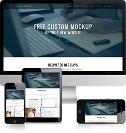
On my website- Digital Marketing- I have a particular offer to do a free photoshop mock-up for your new website that is delivered within seven days at no extra cost or obligation guaranteed.
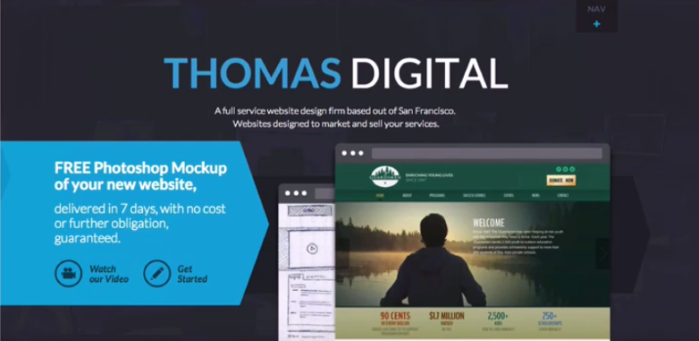
This is what I do when people come to me with the interest of a new website; I will agree to design the mock-up of the home page before they sign up or pay for anything. Once they see my work and like it, we can go ahead and work together. If not, no hard feelings and no obligations. Once I created the offer on my website, my business tripled overnight. This is something that will work best for your marketing design.
5. How Design Affects Marketing
1. Simplicity
When designing your website, it should be simple. Here one of my favorite website you should check it out, square.com.
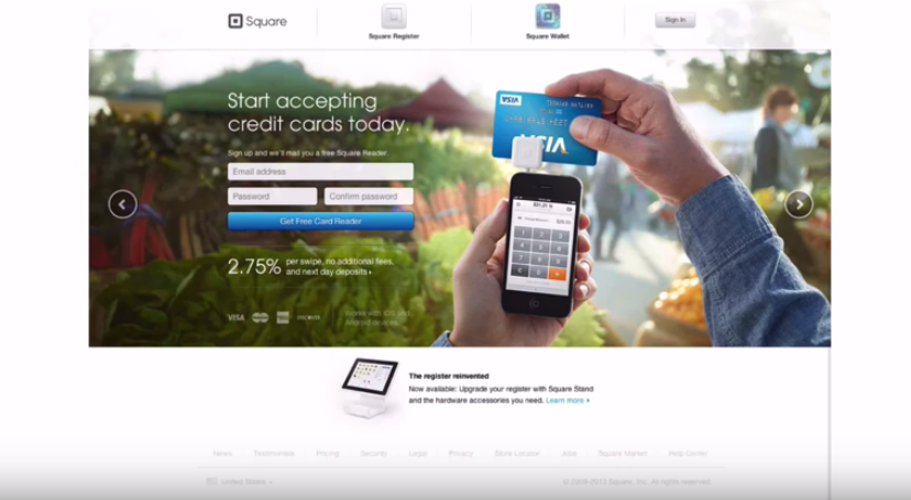
The sight of cause is attractive, professional and well designed. But, check out how many different alignments they have. They only have one alignment, the center, and the bottom alignment.
Also, the website has only two fonts and two different colors- so simple. This is an example of a simple website to do. It does not require a ton of coding. This makes it a good example of a marketing design you can consider having for your website. The website has a clean and professional compelling design.
On the other hand, if you have a payment processing website and has more fonts, many colors, and many alignments, it becomes a complex website. Definitely, it does not look good. Right? Also, it does not look trustworthy and professional as square.com.
The below screenshot is an example of a payment processing website as well. It has like five different types of fonts in the headline. The website does not somehow seem professional. Does this look like a website that is here to help you or to take something away from you? Its design is jarring and predatory within it.
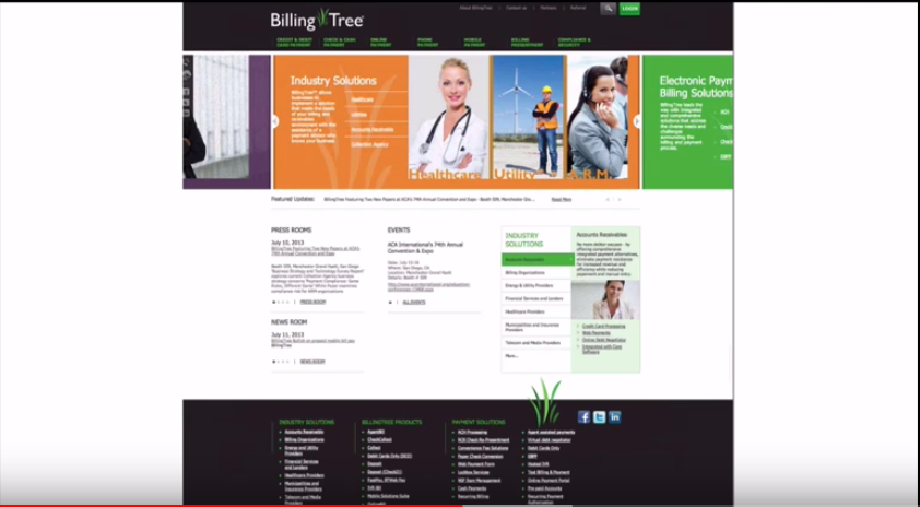
When you compare this design with that of square.com, the square.com website makes you breathe and make you feel that that is something for you. It has a specific call to action and seems like something that could help you come with a solution.
When you check out the apple website, it has two different types of fonts. They have left a lot of white space, making it a minimalistic design. This is probably the best websites on the web.
2. Steal from the Best
There is a great quote from Steve jobs which says that good artists borrow and great artists steal. Here is a case study example of a website I did. The website is for a charity group in San Francisco called guardsman. It was the first website for a non-profit I did a few years back.
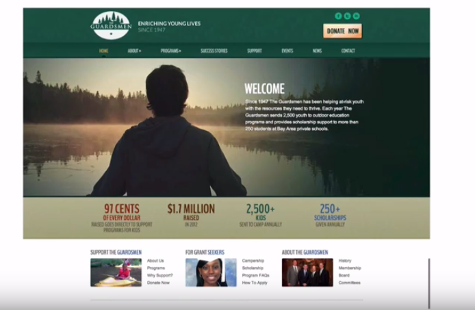
When I was doing the guardsman website and was looking through other websites, I came across the Micheal j. Fox one and I noticed that the call outs of the money raised and the 88 cents of every dollar goes to the program. I also liked the Melinda Gates Foundation which had the four grantees for grant seekers and for job seekers.
When I put together the guardsmen site, I used both of those elements clearly stolen from the two websites. I incorporated the elements and made my own design to kind of highlight the same bullet points for visitors visiting the site.
3. Learn from the Worst
I will help you understand how you can learn from the worst to create a great marketing design. Here is an illustration for that. I used to be an opera singer. My opera teacher told me this great story about Domingo. He was at an opera listening to an opera. He noticed the guy singing the lead tenor was terrible. At the end of the first act, a couple of other opera singers left since he was terrible.
Damingo said that he was staying to learn from the bad singer. He said that he could learn more from the bad singer rather than from a good one. He said that if they were at the Vienna State Opera and the guy leading the tenor role, the guy must be doing something right. Whatever the guy was doing, he was doing it pretty well. Otherwise, he wouldn’t be there. He decided to stay there and learn what it was.
I just loved that thought and thought it was a great idea.
If you take a website like Craigslist, which has an ugly and terrible design but has so much content and information on one place. The website has different categories you could be looking for, and also easy to navigate in one place. And so, from that standpoint, you can learn something. There is something to be learned even though on the surface it might not be a great looking marketing design.
So, from the ugly website, there is something successful about it. Try to figure out what it is, and you might learn something.
4. Use of Graphics to Illustrate Your Message
Use of graphics and images is a great concept to illustrate your message on your website. Here is a good example of a time tracking website. In my thought, everyone’s got ADD these days. So, it would be best of your abilities to add good imagery to tell your story.
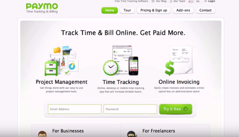
By just looking on the imagery you can clearly tell the website offers time tracking, project management, and online invoicing services. The pictures describe it all! You can just take a quick glance and get a sense of what the website is offering. Isn’t this a great marketing design?
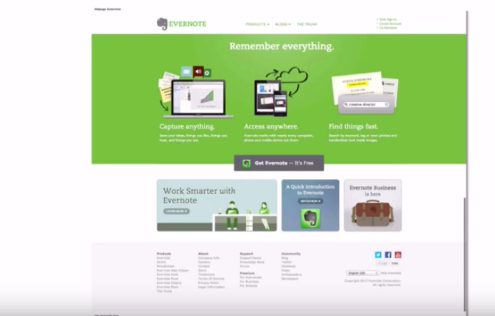
Evernote is another example of a website that uses nice graphics to illustrate what they are offering clearly. Check out the screenshot below.
Here is a case study example of a PR/Technical company I did. Here is a screenshot of the previous site. From what you see, you cannot clearly specify what they do. Right?
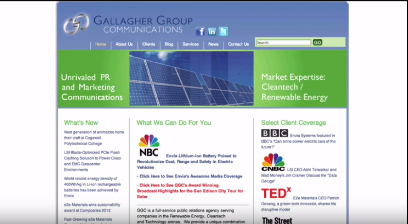
The after effect we put a headline ‘we convert technical material into mainstream that becomes tomorrow’s headlines.’ We also created a graphic to represent that. This is the best way to communicate in your marketing design.
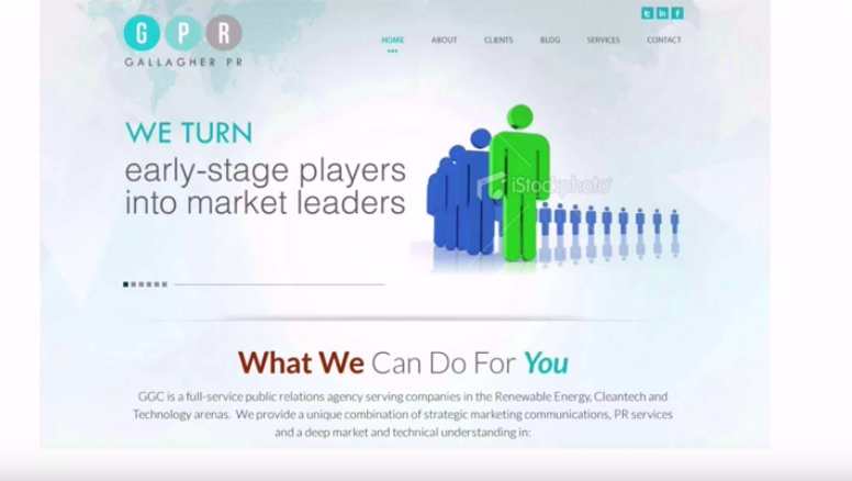
On the same website, we also created a graphic representing ‘We turn early-stage market leaders’ to illustrate thoughts that are hard to express.
Marketing and Advertising Headlines
Check out the below classic headline by David Ogilvy who ran the famous advertising agency, Ogilvy and Mathers. The headline was ‘60 miles an hour the loudest noise in this new Rolls Royce comes from the electric clock.’
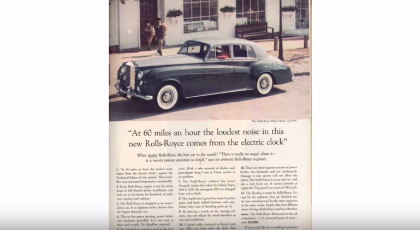
Here is the story on how Ogilvy came up with the headline… Ogilvy was toying with the Rolls Royce for like three months interviewing all marketing people, builders, and engineers. As he was talking to one of the Rolls Royce engineers, one of them commented, and he felt like it would be the best headline.
In a marketing design perspective, this does not seem like advertising. It seems like you are looking at an article as a bold image. This is more of as the top third of the page or a clean headline. The headline looks like it has news to it. It doesn’t seem like it’s meant to sell something, but to pass a piece of information. This is something important when looking is a good marketing design.
Here are examples of marketing and advertising headlines
Let us look at an example of Viagra. It has one of the best headlines which is a warning that if you experience an erection lasting more than four hours to consult a doctor immediately. Most people will take it as a warning label- which it is. But it is really a headline. If a guy with erectile dysfunction, and came across the headline, they will want to have that.

Here is another example of how 97-pound weakling becomes the world’s most perfect formed librarian. All these Charles Atlas ones have like terrific headlines that are worth looking into.
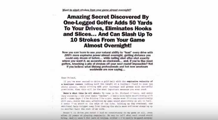
Let us look into another example that is one of my favorite. The headline is ‘the amazing secret discovered by one-legged golfer adds 50 yards to your drives, eliminates hooks and slices and can slash up to 10 strokes from your game almost overnight .’ This is a story about a guy who was selling golf swings. He had witnessed a one-legged man who was golfing and explained how he managed to keep his balance. This is how he got his headline.
The cosmopolitan magazine is another great source to find great headlines. For example,’ 99 sex questions’, ‘we answered the naughtiest things on your mind in 20 words or less’. It could easily be 99 questions about your business. Ninety-nine questions about website design. The framework of the headline itself is worth looking into and stealing because they spent a lot of time thinking about that.’
So, here is a big and dirty secret about internet marketing and advertising.
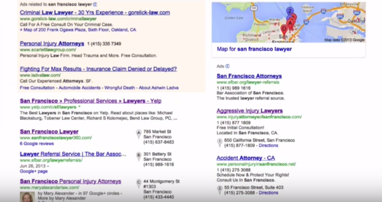
If you are putting something on organic listing on Google, ad in Google AdWords, a map listing on Google map, posting something on Facebook, posting a Facebook ad, putting a headline on LinkedIn or posting an ad on linked in. You are just posting a message, headline, and call to action.
People will always click on things that are interesting in their lives. Here a metaphor that can explain. When people are trying to build an airplane or get the idea to build the airplane for the first time. The idea will be just to get a big engine enough so it could be powerful enough to fly. Many people will just focus on that- the way to get the airplane to fly.
The Wright Brothers, on the other hand, took the complete opposite direction. They decided to get a glider light enough to float in the air almost on its own. Then later get a tiny engine and put it on thereto get this thing to fly. This was the right way to do it.
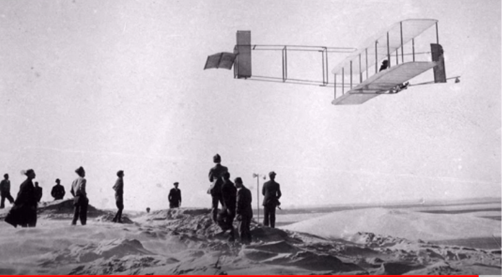
So, this is the same metaphor that can be used for internet and advertising.
Jet fuel is the traffic. Your tools are the ads on Google or Facebook or posting on YouTube or Twitter. Your website is the glider. If your website is not converting, doesn’t have a great headline, a compelling offer, doesn’t illustrate things well visually or message, it is not going to take off no matter how much fuel you put on it. It will not fly!
Therefore, it is important to note that the key to internet marketing is to come up with a great message and a great marketing design. So, it is a market, message and media that is the old Dan Kennedy Formula. The idea is to be able to make your website to take off by converting then you can get to SEO. When you are at this level, you can pay for Google traffic and ads which will take care of itself.
The idea here is the message and the market media. For example, you are in a great deal of pain and want to use Excedrin extra strength. You only get the Excedrin regular strength. Same too if you had a really bad migraine.
You want to use Excedrin migraine for the pain which costs a dollar more per bottle. But, what if you found an alternative with the identical ingredients of the same strength? Which one will you buy? Of cause that of a lesser price. This is what is known as marketing.
Is graphic design part of marketing?
A marketing design goes hand in hand with graphic design. Without visual content, you might miss the message being communicated.
What then does a marketing designer do? Marketing designers use their creative and technical skills and develop ways for businesses to market their products on their client’s website.
Most people ignore the use of graphics on their website, but using them is more will make their visitors notice their website more. For a business website to have the best marketing design and become effective, it must incorporate some imagery.
Today, graphic design has become a key component of a marketing design to bring about brand awareness and also influence customers’ decisions.
Visual Elements In a Marketing Design
Call to actions (CTA)
Graphics is a great way to connect emotionally with the audience. When your web visitor is interacting with your web page, it is important to have a call to action. The call to action makes the visitor perform an action.
Designing a call to action graphic will grab the visitor’s attention more than using a normal call to action.
Inforgraphics
90% of information transmitted to the brain is visual. Therefore, a website that has graphics sparks more engagement than that with content only and grabs the attention of users easily.
Infographics stand out when compared to other visual formats. You can present information or knowledge in a clear and attractive way. When information is presented in a unique format, it becomes more influential and convincing.
Blog posts and texts
Visual content is usually processed fast that text. Before your web visitors begin to read your content, their opinion first comes from the design.
It is important to have graphics in your blog posts to attract the attention of your visitors. Appealing graphics within a blog post will make your visitors continue reading. Images break long sections of text and also illustrate the point being made.
Conclusion
Well, there you have it. I believe you will use the above marketing design secrets on your website. Don’t forget to check out my mafia offer of a free photoshop mock-up of your new website before you sign up or pay anything.

