Restaurant Website Design
The Ultimate Guide to Creating the Best Restaurant Website Design
A great restaurant website should be attractive and effective. Some designers get carried away by the visual aspect that a restaurant website carries. Others concentrate on creating a website that is simple and straight to the point. But, what should a great restaurant website design entail? It should blend in both the visual and the usefulness in one design.
A perfect restaurant website design will allow customers to find relevant information like menus, location, operating hours and contact information with ease and without any distraction. However, customers should also get to know what the restaurant is about, the quality of food and services offered through the design aspect of the restaurant’s website.
Dining out is an experience, and the experience begins with the restaurant website. Therefore, it is critical that the website of any restaurant should encourage visitors to visit the restaurant. Here are some key elements of a professional website;
- It should have professional photographs.
- The website should have a short and clear copy.
- You should easily access the restaurant’s location, contact information and hours of operation.
- The restaurant website should have social media buttons.
- It should have a platform for online reservations.
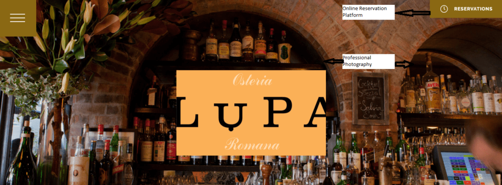
Lupa restaurant is an example of a restaurant website design inspiration that is attractive and effective. It has the above key elements. Check out the screenshots below.
Amazing Restaurant Website Design Templates
With that in mind, we have compiled a list of top 10 restaurant designs that have successfully followed the recommended idea.
Liceas
Liceas is a WordPress theme that is simple yet unique. It has successfully brought out the visual design element and the usefulness in the design. From this design template, you can clearly see the business operating hours, location, and contact information from each page. The large images will definitely entice you and make you drool as you go through the menu.
Caravan
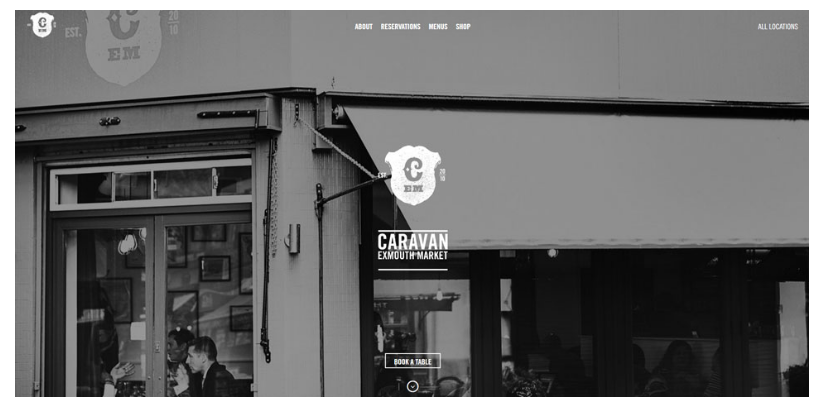
Caravan design brings both a classic yet simple design. It has everything that a customer needs- menu, contact info, address, reservation options, events calendar are all displayed on the home menu page. The restaurant website is not fancy hence does not have any distractions. It is just a clean restaurant website design inspiration for your restaurant.
Jacks Bar
Jacks Bar used the WordPress platform to create a beautiful yet effective one-page restaurant website design. The one-page design allows them only include what is necessary to prevent unnecessary distractions. All information that the customer needs is available on a single page thus saving them the time of searching around the website.
The design also incorporates a pop-out video that is worth looking at for some inspiration. In short, the website design clearly displays its atmosphere and extremely well done.
Toca
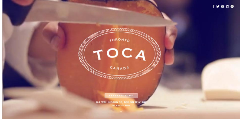
Toca is a good example of a one-page restaurant website design. It is a simple design where customers can find all the information they need with just a click. The design has a full-screen video showcasing the restaurant’s expertise.
PHO
PHO is another WordPress website. It has a unique visual appearance. You can find the information you want by clicking the custom icons on their menu. This makes the website user-friendly and provides a pleasing experience for the customers. It takes social media seriously and has social media icons on every page.
American Restaurant
Its tagline best describes the website design, ‘Big, bold and beautiful.’ The American website has a bold yet elegant visual approach. This creates an attractive environment for visitors.
Mialino
Mialino’s homepage has a menu graphic that is incorporated into it. This feature makes it unique from other restaurants websites. It is a unique concept that you will rarely see and this makes them stand out.
Desert Chill
Desert chill website is designed with beautiful and bright colors for an ice-cream business. It blends well with the bright red and bold colors.
Bar Isabel
Bar Isabel is a one page WordPress restaurant website. Amongst all websites we analyzed, bar Isabel stood out! The dark look looks amazing. The design is simple and straight to the point. Its simplicity is mysterious, and it may make you want to what they are all about.
Earls
Big earls kitchen + Bar has a big, bold yet simple design. It has little text and makes it easy for customers to find what they are looking for. The design also creates an atmosphere and experience that every visitor will enjoy.
How to Create an Amazing Restaurant Menu Designs
Whether you like it or not, marketing is essential for every business. Therefore, it is important to let your marketing techniques play along with people’s psychology. Your restaurant website design should have at least some elements that would make visitors feel a certain way or take a particular action.
You can call it whatever you like- the power of manipulation or suggestion- but businesses are using techniques that can influence decision making. In fact, restaurants are the leading businesses known to use psychological strategies when designing their menus.
If a restaurant has a great menu design, it can enhance a great dining experience. This will help customers to make satisfying decisions and also stimulate their appetite.
A restaurant menu is only a list of dishes available, and it is also a great advertising tool that can communicate the identity of a restaurant and help increase profits.
When creating your restaurant website, you design your menu and display it for every visitor to check out what you offer. What visual strategies in your menu design do you use to create the most effective menu for your restaurant website? Read along to get more ideas on your perfect menu design.
Design your own Menu!
I know most people are wondering how they can create a menu. It is not complicated to create one. Canva is a simple online tool that can help you create an attractive menu. It gives you some templates to choose from. You only need to customize one then you good to go!
Create a strong first impression
Dinners tend to scan a menu in a few seconds, and they do it starting front to back. This means that a menu has a small impact on the customer’s decision. To stay on the game, you need to create a menu that can be easily scanned using clear section headings, easy to find dish titles and incorporate your best visual techniques.
Divide your menu into Logic Sections
Designing your menu is the key to having an effective menu. First and foremost study what your competitors’ menu looks like. It may sound easy, but a great menu design is more than a list of words printed on a paper. Unless it is professionally done, it will not bring any business.
Dividing your menu into different sections makes it easy for customers to choose what they want to have. You can do this by arranging your food on the menu into logic groups. You can have a section for breakfast, starters, desserts and main dishes.
Depending on the size of your restaurant, one or two columns will make your menu look attractive. Adding more columns can make it look like a newspaper classified which is not appealing to the eye.
Use Attractive Photos
If you choose to use photos on your menu, then they must be of high quality and professional. It may be costly to design such a menu, but still worth the hustle. The food images you choose to appear on your menu should create and combine pleasure, atmosphere and tantalizing urge. The appearance of the menu should make the customer want to buy your food.
Use images that are clear and attractive to highlight your best sellers/ money makers, and make them big for everyone to see. Remember, when people decide what they want to buy the look of the menu first attracts them. Most of the time the best looking menu wins most customers attention- the power of advertisement!
Choose Attractive Colors
We have seen that the appearance of your menu dictates how customers will buy your food. Therefore, choose your colors based on your target audience and also the theme of your restaurant.
Different colors schemes offer different physiological effect on the viewer. It is important to choose a color theme that will set the right mood of the restaurant and also draw the attention of the food you sell. The best Mexican restaurant website designs have a warm color scheme that helps attract more customers.
Have Clear Menu Descriptions
Make sure the description on your menu makes your guests want to taste your food. Don’t be afraid to explain what your dish is all about. You can also use ethnic names if need be to add some authentic flair. Adding a rare ingredient in your food will make your guest want to know more about it. This will give your server an opportunity to describe the dish in details and hopefully sell it.
You can make your menu unique by incorporating a local history of the menu item. For example, you can have ‘Maine Lobster roll’ on your menu. The item name sounds inviting regardless you are having it in Maine or somewhere else.

You now have your website and menu design in place. How do you make your website visible to your potential customers?
Next, we will look at how to go about local SEO to increase brand awareness and visibility.
Best Local SEO Tips for Restaurants to Increase Brand Visibility
The application of local SEO helps to position your restaurant to your potential customers on the search engines.
This guide will definitely increase your chances of ranking and also improve your local SEO! Every business owner craves to be on the top ranking in Google and Facebook. Therefore, local SEO is a necessity for every restaurant owner, and it determines whether your restaurant will succeed or not.
I am sure you have come across the best restaurant website in 2017 and wondered how the owners could stay on top of the game. Proper use of SEO is the key thing.
When it comes to local SEO, here are two things that you should not ignore;
- The number of customers accessing your restaurant using their mobile phones. This means your restaurant website should be mobile responsive.
- Nearly 50% of customers checking out your website on Google and checking whether it is available on Google. Therefore, it is necessary for you to have a Facebook page for your restaurant. Here are tactics to use to optimize your restaurant website.
1. Optimize your Website and its contents for Local SEO
The first that can do is to optimize the website and its contents. Most importantly you need to consider the audience needs other than just the search engines needs. To be on top of the search engines, you need to have strong and relevant titles and H2 tags.
Meta descriptions should also be clearly written telling the customers a glimpse of what you exactly you offer on your website.
Additionally, it is also essential to include your physical address along with your contact information. They should be visible for customers to see.
2. Use Google Places and Google +
Google places make it possible for your restaurant business to show in Google search and Google maps for physical location. Customers can find your address, operating hours and the contact information needed when placing the order.
Google + on the hand lets you communicate with customers and also respond to reviews they have left on Google. It creates a perfect communication channel to keep everyone updated.
3. Set up a Google Business Page
Google is the most used search engine. Listing your restaurant business on Google is wise. When listing your business, you will be allowed to create a 300-word post that has a photo, links for visitors to sign up or learn more.
You can use the post to announce special events or special offers. You can add links to your menu and a URL for reservations.
4. Make use of Online Citations
Online citations will help your restaurant to gain exposure. It is also a good source of traffic. You can list your restaurant with sites like Foursquare and yelp to get reasonable views and traffic. You will notice an increase in the number of enquires. I highly recommend that you claim your businesses and ensure your listing is;
- Contains up-to-date information
- It is complete with an appropriate image
- You respond to all reviews on time
5. Use other Sites for Traffic
In case your restaurant website is not ready; you can invest in other sites. First, visit websites that your customers visit when looking for recommendations. For example, you can use sites like TripAdvisor, Yelp or Zomato.
These sites appear on Google, and you can go ahead and build your business pages. They already have a large audience and traffic, therefore, can help build your business. Remember to add links to your social media profiles to give you more exposure and traffic to your pages. When many people check out your business pages on Google, the likelihood of it appearing on the search results.
6. Include your Restaurant Menu
Most customers love surprises, but they also love to know what to expect in a restaurant. They like to know what the food is like, the prices of the food or even decide on what to eat before arriving at the restaurant.
Do not overlook the menu feature as it can drive a considerable amount of traffic to your site. You can list your menu on third party websites. Make sure that all the information on the menu is up to date. The information should be consistent.
You have successfully set up your restaurant website and known how to apply local SEO to get traffic. But, how responsive is your website design? Next, I will take you through a guide for making a responsive restaurant design.
The Ultimate Guide to a Responsive Restaurant Website Design
Do you have an idea of what is the meaning of a responsive website design?
The online world is changing every minute. Many people have adapted using their smartphones and tablets to browse through the internet. There is a good chance that your customers may use their smartphone to check out for a place to dine after getting out of work.
Back then, business owners used to create two separate website for the companies- one for that is desktop responsive and another that is mobile responsive. Today, companies have the option to use a website design that is responsive.
Here, we will review what responsive design is and why it is beneficial to your restaurant business.
What is a responsive Restaurant Website Design?
Responsive restaurant designs are easily adapted for mobile devices. The user gets an exact experience on the mobile device as they could on their desktop.
Check out a screenshot of the Blue Lagoon Restaurant on a desktop screen.
Here is the same screenshot on an iPhone
And here is how it appears on an iPad.
Responsive website designs adjust to any screen size. Working with such a design will make you worry less about how your website appears on other devices. People will eventually find what they are looking for from your website regardless of the device they use. Here are the advantages of using a responsive design for your restaurant.
1. A single Website to Maintain
Using a responsive design lets, you maintain and manage a single website. Instead of maintaining a desktop design and a mobile device, it adopts any device that the users are using and gives them the same experience. Also, there are fewer design updates to worry about.
No matter what devices your visitors are using to access your site, a responsive design will adopt the device they are using. This will make the website functional and easy to navigate no matter the device used to access the site.
2. No Need to Create a Mobile App
Many people wonder if using an app for their business is the best option to sort out issues of a responsive website. After all, many smartphone users enjoy using mobile apps.
There are mixed reactions over using a mobile-friendly website and using mobile apps. Using mobile apps stands out over using mobile apps. Some people will not want to download an app to check out something from the website.
Also, a responsive website is way cheaper than developing and marketing an app. It may make sense for some companies to develop an app for their website, but a responsive website will always sort out your responsive problem.
Your customers are already used to your desktop experience and will also ant the same experience on their mobile devices. Your responsive mobile design should be similar to your desktop version.
3. Responsive Design is the Best for SEO and Social Sharing
A responsive website design helps improve your website’s SEO and Social Sharing Optimization. It is important for your website to be optimized in these two areas. This is because the search engines and social networks are responsible for bringing traffic to your site. This means potential customers will be on the door knocking!
Using a responsive website design will make your website to be completely optimized for search. Google endorses responsive designs for a mobile experience.
Nowadays, people are using their smartphones more than they are using their computers to browse social media sites. Social media attracts likes and shares and having a responsive website makes it easy for people to view your site right from their mobile devices.
If you follow the above tips, you will have a successful restaurant business. However, this is not enough. You need to think outside the box and think about how to bring more income. You can do catering to expand your business. Here, you will get to know everything you need to start a restaurant business.
A Guide to Restaurant Catering
Most restaurants have gone beyond their dining rooms to bring more business by catering. On-premise and off-premise catering have become increasingly common for many restaurants. Restaurants can increase their sales by catering private parties and large occasions like weddings and business conferences.
Restaurant catering can be categorized into two categories.
- On-premises catering- Customers visit the restaurant for a special party.
- Off-premises catering- The restaurant arranges and takes food to the customer, either at their home or the place they are holding their occasion.
Restaurant catering includes;
- Wedding parties
- Birthday parties
- Anniversary parties
- Holiday gatherings
- Business meetings
- Luncheons
Restaurant Catering Menu
You can design a restaurant menu whichever way you want. It can be simple or as elaborate as you want it to be. Catered functions can be either plated meals or buffets.
The catering menu should be flexible like that of a regular dining room menu. You cannot offer everything as your dining menu since some food will not hold up for a long time that catered food is required to.
Make sure to do your homework before pricing your catering menu. It is also necessary sure to find out how much other caterers charge for catered events. Make sure also to visit your grocery store to get a clue on what they charge their party platters.
Restaurant Catering Fees
Restaurant catering for big events takes up much time than just an ordinary meal in the dining room. You need to cover all the costs that are involved during the catering. Avoid adding so many costs so that customers do not feel like you are trying to extort some money from them. Also, know what your close competitions are charging before making up your mind. The fees to charge include;
- Room Fees
- Clean up fees
- Dance floor fees
- Bartender fees
- Delivery fees
You can also have a time limit for the use of your facility and after that charge an hourly charge for any extra time. If you decide you decide to combine catering services with your regular services, make sure you are staffed at both venues.
Rules of Restaurant Catering
Before preparing for a catering service in your restaurant, you should strictly follow the below rules.
- Headcount
- Time limits
- Proper organization
- Time limits
Daily operations of a restaurant require tremendous organizational skills. The same case applies to catering. You need to prepare for serving large meals at one time, pouring champagnes, cake cutting and overseeing the bar.
Planning a Catered Event
When planning for a catered event, you need to know exactly what your customers need. You must be able to answer the questions they ask you about the restaurant. Some of the questions include;
- What is the experience of the chef and what is their style of cooking?
- Do you have any health inspection reports?
- Do you have enough staff?
When you cater a function in your restaurant, you can clearly know your strengths and also improve on your weaknesses. Catering is a great idea to boost sales and also improve your advertisement by word of mouth.
You should aim at having the best food website design that allows online ordering from your customers. Next, we will check out the importance of integrating a system that will allow your customers to right from their homes.
Boost Sales and Customer Loyalty with Online Ordering
Did you know that having a website with an online ordering system helps increase sales and the number of customers in general? Many restaurants have partnered with creators of online ordering systems on the web. Here are things your restaurant will need for an online ordering integration.
- The online ordering system should seamlessly integrate with your restaurant website design
- Accept credit cards and make it easy for customers to save their information for easy repeat ordering.
- Advance ordering
- Have delivery zones- places customers can pick-up their orders during set aside days and time
- Include delivery fees
- Coupons
- Tips
- Facebook online ordering menu
- Customer feedback surveys
- Use a tool for marketing. For example, MailChimp.
Always have professional help on the stand by to help customers whenever they are stuck when placing their orders. When you do the above, you will up and running and taking in thousands of orders.
Reasons for Having an Online Ordering System for Your Restaurant
Are you still convinced that an online ordering system for your restaurant can create a great experience for your customers? Here are some reasons why an ordering platform for restaurant matters.

1. Convenience
Customers are always busy and waiting for their food is the last thing they would want after a long day at work. With many responsibilities waiting for them, what customers always want is to get food at their convenience.
How can restaurants create such an experience for their customers?
With online ordering, customers can place their orders from the comfort of their homes. Once done, they get to choose their pick-up location or even at their doorsteps!
On the other hand, restaurants step-up and prepare the food for their customers based on the collection time while still serving their dine-in customers.
2. Location of the Restaurant is not an Issue
Customers can order from any restaurant even if it is out of town as long as they can deliver to your doorstep or have a close pick-up location at your area. It doesn’t matter whether the restaurant has great food, being inaccessible is a big turn off to many customers.
If you have lost out to your competition due to the location of your restaurant, you can still improve your game by providing an online ordering system.

3. Getting Exactly What You Ordered
Nothing is frustrating like opening your to-go container and finding something totally different. Sadly, this happens most of the time. The customer may have been inaudible, or some staff might be just clumsy and keyed it wrong.
Online Ordering takes out the element of human error. This is why most customers love it! The ordering interface is user-friendly and allows customers to view their entire online menu including any running promotions and combos.
4. Payment is Never a Hustle
Many restaurants have different payment methods, and it would be a shame if your restaurant is only stuck to cash transactions. The online ordering system may allow customers to pay using their credit card or may order via their PayPal accounts.
5. Avoid Peak-hour Crowd
Lunch and dinner times are the most hectic times for any restaurant. It is almost impossible to get a table at this time. An online ordering platform can be of great help to help your customers beat the peak hour crowd. How? You can order your dinner and have a home delivery preventing you from worrying about getting a table. Simple as that!
You can also place your orders earlier. This, therefore, means that they will be ready when you need them. It is also possible to place the order several days before.
Creating an effective website is never a simple task. It may require you to hire a website design professional to do it for you. I know you have seen restaurants online that have been categorized to have the best restaurant website design 2018. This is because they have followed and used a similar guide to what we have here. A great restaurant website design will make your restaurant website attractive and effective. Remember, how your website looks translates to the amount of business you will have.
PORTFOLIO
100% Custom Design. We never use pre-made template. Ever.
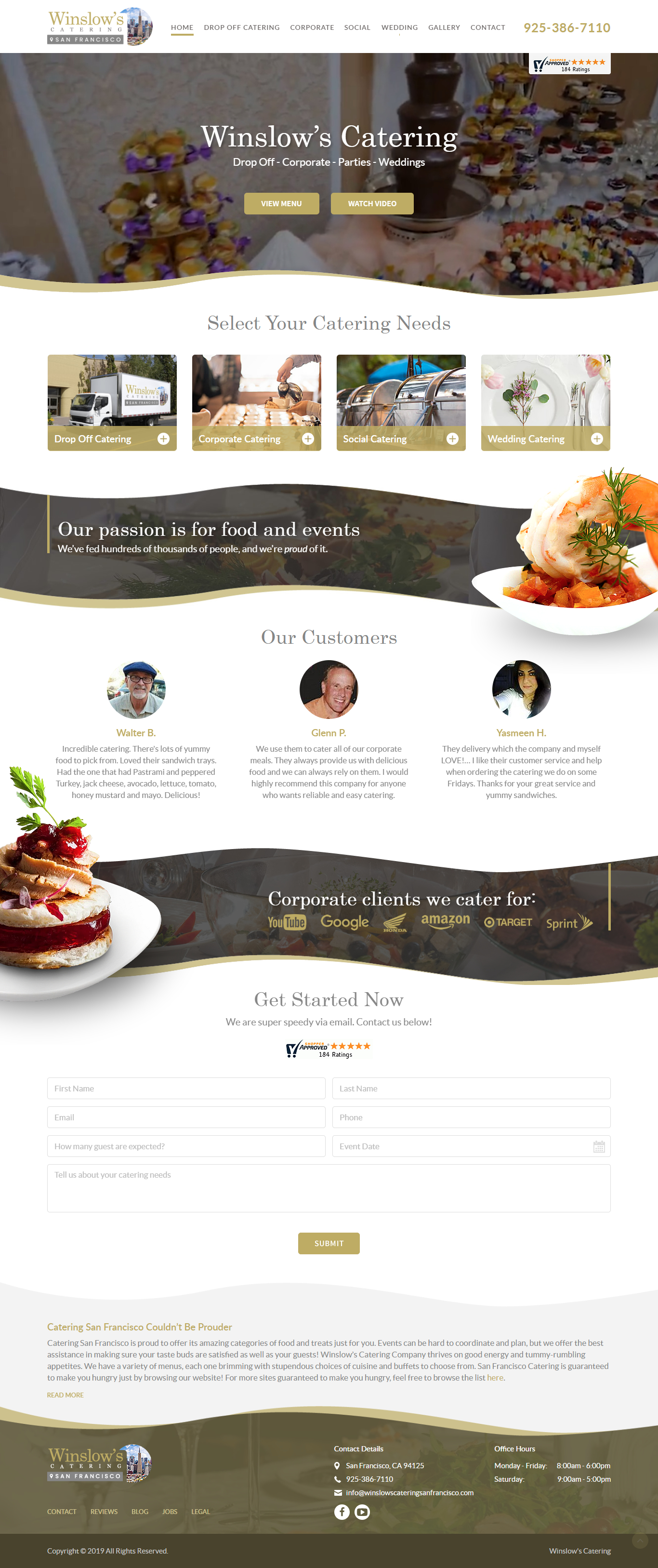
Winslow’s Catering
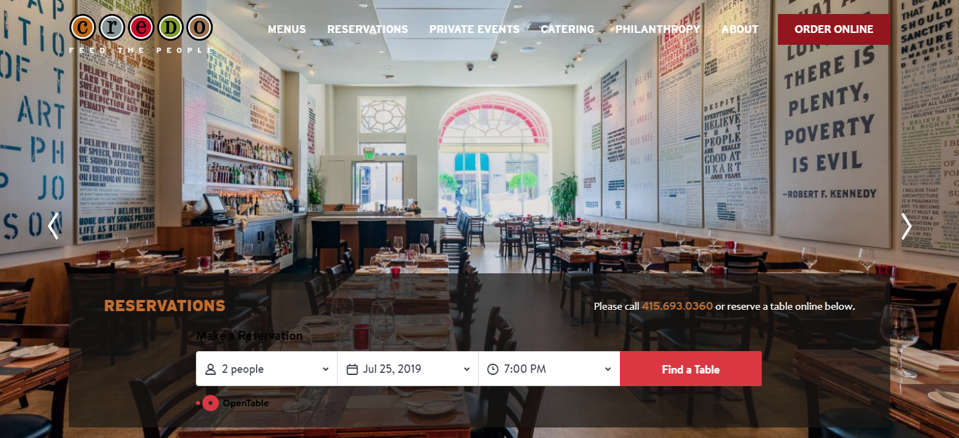
Credo Restaurant LLC
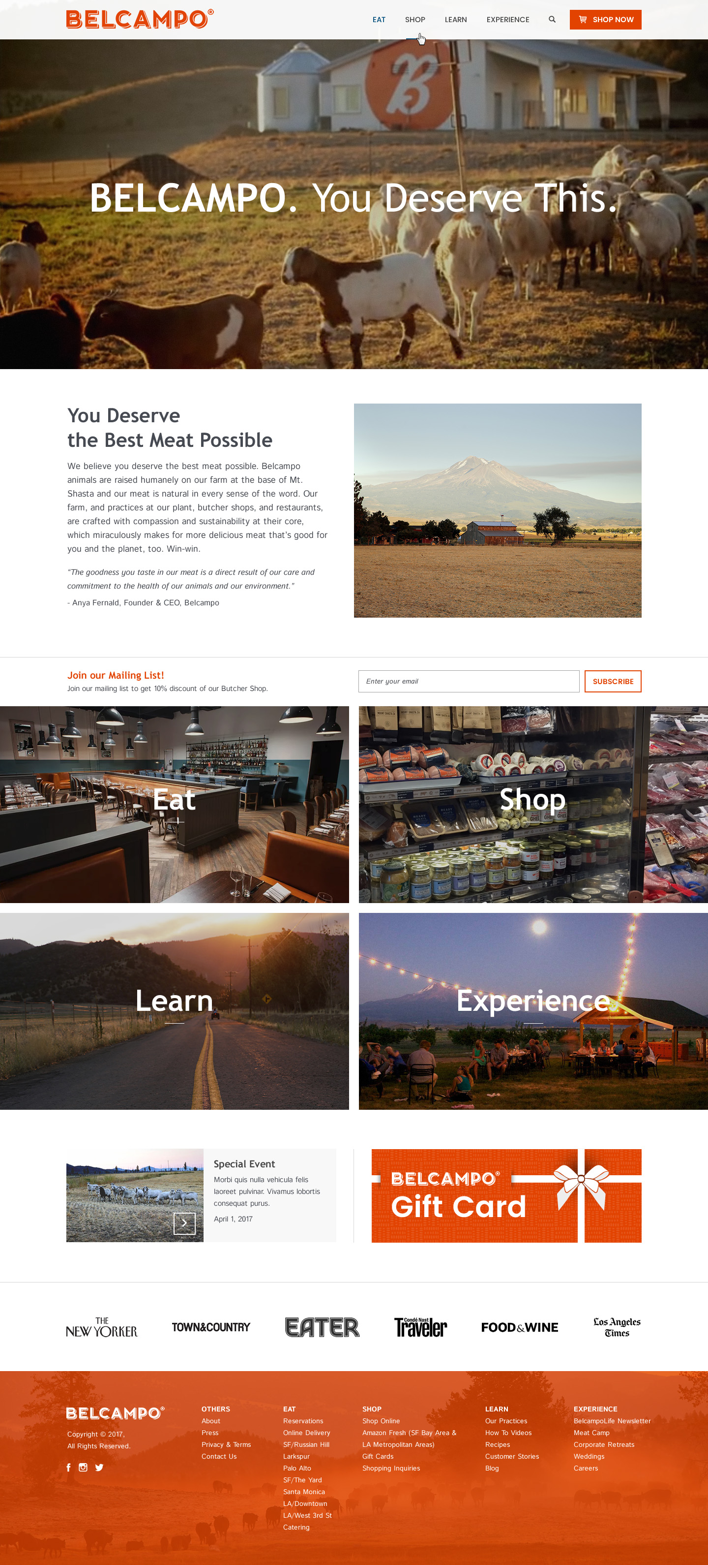
Belcampo
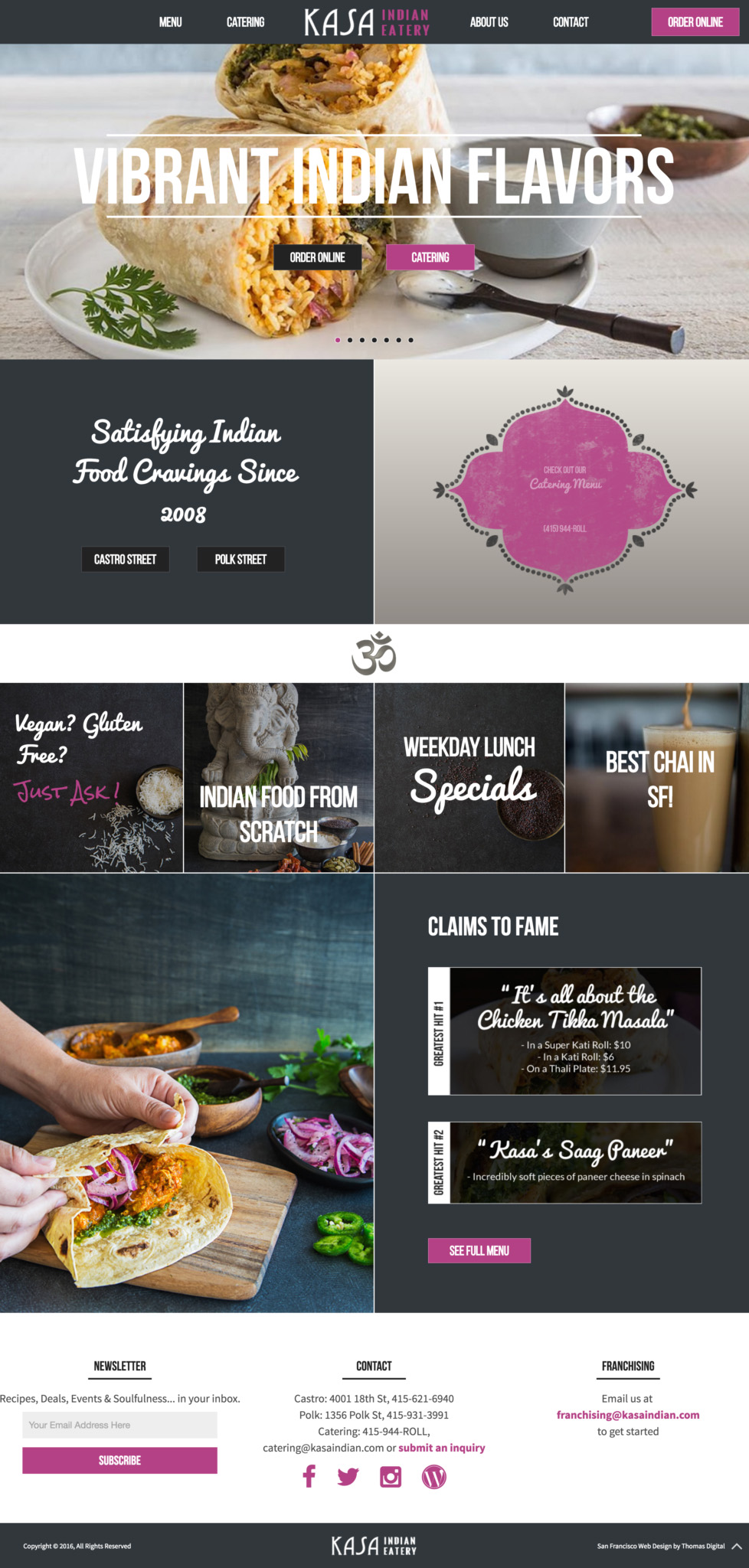
Kasa Indian
Next Steps
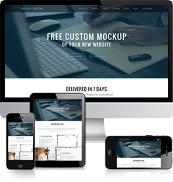
Ready to take the next steps? I’ve got good news. Unlike with other web design firms, you’ll actually get to see exactly what your new website will look like before you sign or pay for anything. Sound too good to be true? Click below to read more about our Free Mockup Offer.
FREE CUSTOM MOCKUP
OF YOUR NEW WEBSITE DELIVERED IN 7 DAYS
We’re so confident you’ll love our new design for your website that we will design you a custom mockup of your new website before you sign or pay anything.
If you like the design, we can then move forward in working together.
If not, there are no hard feelings and no further obligations.
Keep reading to find out exactly how it works.
HOW IT WORKS
1 FILL OUT CONTACT FORM
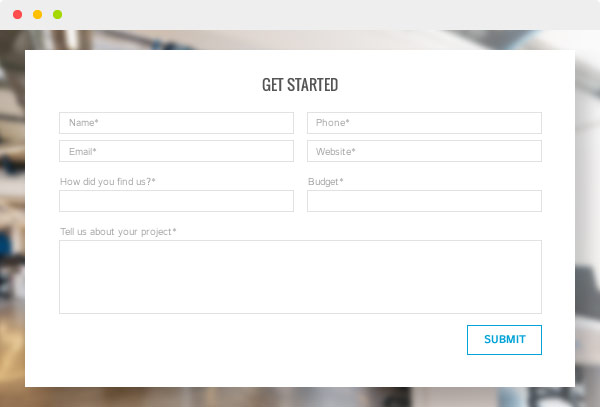
The process starts when you fill out our contact form at the bottom of this page. You will receive a response email within 1 business day requesting that we schedule a call to learn more about your needs. We’ll need to have a brief phone conversation to get a sense of your project’s scope to be able to give you a proper quote.
2 INITIAL PHONE CALL
Our initial call will take 15-30 minutes. We will ask you a series of questions to determine your goals for the website, key functional requirements you have, your timeline and other important considerations that will affect the scope of the project.
3 WE SEND YOU A PROPOSAL
Within 2-3 business days we will email you a proposal for the project. This will include a detailed list of all the services and features provided as well as a timeline for the project and a quote for the project cost.
If the scope and budget of the proposal works for you, then we can move forward with the Free Mockup offer. At this point nothing has been signed and no money has exchanged hands.
4 WEBSITE QUESTIONNAIRE
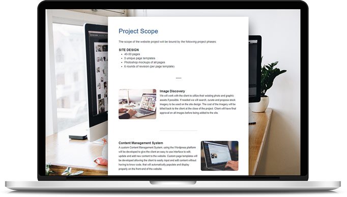
We will send you a detailed questionnaire to get a sense of the vision you have for the new website’s design.
This will include links to other websites you like the look and feel of, as well as fonts, colors and other visual elements you would like to include.
5RECEIVE YOUR MOCKUP
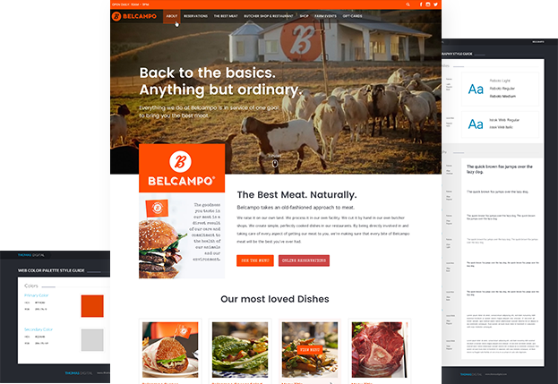
After receiving your input from the questionnaire we will then have a Photoshop Mockup of the homepage of your new website within 4 business days.
This mockup is just a preliminary draft and should we work together you will have ample opportunity to revise the design until it is just as you like it.
6 CONTRACT
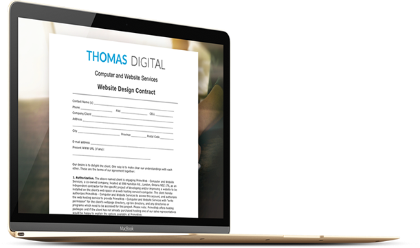
If you like the mockup and want to move forward in working together, we will then sign a contract with the same terms outlined in the proposal.
7 NO HARD FEELINGS
If the mockups wasn’t quite what you were looking for, then there is no obligation and no hard feelings. You owe us nothing and have gained a better sense of what you’re looking for in a website.
The only caveat is that you would have no legal right to the mockup design we made and could not use it for your website without full compensation.
OUR SERVICES

Custom Website Design
All of our designs are made from scratch in Photoshop, designed specifically for you and your company’s unique needs.

Custom Wordpress Development
We never use pre-made templates. Ever. All of our sites are 100% custom developed to be super easy to update and edit on your own without having to know how to code.

Mobile Responsive Design
On average over 20% of all website visitors view sites on a mobile device and that number is only rising. All of our sites are developed with fully mobile responsive designs that adapt for the iPhone, iPad and all other mobile devices.

Marketing Design Strategy
We don’t ‘just’ design pretty websites, we strategize a design and user interface focused on marketing and conversion. We use the psychological ‘weapons of influence’ as outlined in Robert Cialdini’s book Influence to stack the deck in favor.

Search Engine Optimization
We provide on page Search Engine Optimization for the sites we develop. We research the most relevant keywords and tag and structure the site to rank for those keywords. We also practice what we preach. If you Google ‘San Francisco Web Design’ or ‘Hire a Web Designer’ we’re the #1 result.

User Interface / User Experience
We identify the various user types visiting your website and then create a clear path for each user allowing them to easily find what it is they are looking for.

Tony Neglia
Highly recommend Thomas Digital! Was a bit reluctant working with a company so far away but with numerous online reviews we [...]
Anthony Giudice
I can’t express how wonderful it was/is to work with Victor and his team at Thomas Digital. When I set out [...]
Jenna Henderson
Victor was helpful throughout the whole process, and we are so happy with how our website turned out.
Keara Neifach
I cannot recommend Thomas Digital enough. I worked with Victor and his team on a site at my previous place of [...]
Wayne Herr
After searching for a web design firm locally in Florida without much luck. I thought to myself where would the best [...]
Scott Pietro
Thomas Digital and Victor are great to work with and we are very pleased with our end product, an updated business [...]
Scott Petty ESQ.
I recently used Thomas Digital to create a website for my company and I’m extremely pleased with the end result! I [...]
Rachel C.
Victor took my project on a super tight deadline when other companies refused outright. He was super quick to respond and [...]
Keeley Rankin
I cannot say enough good things about working with Victor and his people. He was extremely professional, organized and straightforward. Victor [...]
Jamie H.
Victor is the easiest person to work with which makes getting a website designed a seamless process instead of daunting. He [...] ';
';
Emad E.
I am thrilled with my website, very professional , honest and easy to work with. i wish that he worked on [...]
Les F.
ThomasDigitalDesigns was everything I could ask for in a web design company. Victor was always very responsive and made every attempt [...]
Treasures P.
Thomas Digital Design did a wonderful job designing treasurespavilion.com. The work was done in a timely fashion and whenever I had [...]
Susana C.
Thomas was great to work with. I found him to be reliable, knowledgeable and fair. In the end, for my own [...]
Your E.
Thanks Victor. I just needed a simple 3-4 page done for my business, Basic i thought. Basic is certainly not what [...]
Chris C.
We went through several other web designers before we found Thomas Digital Design, and are completely satisfied with all aspects of [...] ';
';
Gina J.
We needed an updated and redesigned look for our seven-year old website. ThomasDigitalDesign turned out to be the best and most [...]
Emily A.
As a solo practitioner, I didn’t have endless funds to develop a new Web site with the bells and whistles of [...]
Pam Pam G.
Hello, I am excited about the way my bizness will be seen. Victor,, gave us a great start with our new [...] ';
';
Kevin F.
I am very pleased with my dealing with Victor. He built my site exactly as I requested, made changes as needed, [...]
David V.
From the moment I saw Victors own site knew he would be great. He understands clear effective communication in the media. [...]
Mahesh R.
Victor has given my website life that it never had. He is amazingly patient and made revisions until I was happy. [...]
Thomas J.
When you are a start up business and building your companies web site priorities and direction changes constantly. Victor at Thomas [...]
J L.
I am thoroughly pleased with all Victor did for me. He was very, very responsive, affordable and made it a seamless [...]
Kate M.
Victor is gorgeous: easy going, patient, knowledgeable and kind. He designed a customized website for my parents’ small business. And has [...]
Nima G.
I have had to do many websites for different businesses and for some reason it always ends up turning into a [...]
Len F.
I needed a website to support my soon-to-be-published book, and I shopped around for a quality designer at a reasonable price. [...]
Carla M.
WOW! That’s how I felt after Victor was done with the redesign of my website in less than ONE week. He [...]
Wendy M.
Victor Thomas did a fantastic job designing my BikramYogaMorganHill website! He’s smart, attentive, efficient and eager to please. He delivered a [...] ';
';
Kevin A.
Our company website was old and tired. We looked into several companies to redesign our site, and were met with vague [...]
Bud G.
As a non-profit sports club, I was thrilled to find a quality and cost effective way to set up a great [...]
Nate C.
Victor Thomas is a fantastic web designer and developer. So far, I have utilized his talents for three projects. Victor has [...] ';
';
Michele L.
Certain qualities in a vendor are much appreciated-timeliness, willingness to listen to the customer, professionalism in his work and interactions, and [...]
Deirdre R.
It’s all true what they say about Victor! (check out the 35+ filtered reviews). Victor is highly professional, friendly, efficient, organized [...]
Catherine G.
Prior to using Victor, I emailed several designers to determine who would be a good fit. Victor was the most responsive [...]
Cristian C.
If you need a website created for your business contact Victor Thomas. thomasdigitaldesigns.com. I just finished working with him to create [...]
Andrew R.
Designed our company website. Victor was responsive, did quality work, and pricing was fair. I would definitely recommend him to others.
Rebecca B.
Victor delivered 100%, in the time he estimated and at a fair price. No fuss, no muss. Not only did I [...]
Chris J.
When searching for a web designer I wanted to find someone local and personable. Most designers try to sell you a [...]
Tingting P.
I would give Victor 5 star. He is very organized, professional, knowledgeable, and honest. Different that the many web developers I [...]
Clay B.
We began working with Victor and his team late last year. Our business website was outdated, and we wanted to do [...]
Chris Jones
Victor was patient and flexible, and easy to work with. I can also say that Victor’s follow-through was excellent. He helped [...]
Richard Hanson
Thomas Digital created a site for my consulting business that was exactly what I intended.
Rena Ramirez
After a long year of almost nothing but disappointing interactions with graphic designers and webs designers, Thomas Digital (Victor Thomas) was [...]
Brock Benson
Having gone through what was a painful process of getting a website live before, I expected this time to be the [...]
Kelly Krueger
Thomas Digital has given my small business the opportunity to enjoy a big business web presence at a small business price. [...]
Deborah Frieden
Victor was a pleasure to work with and the website he built for me is exactly what I hoped for. I [...]
Courtney Campbell
Thomas Digital is a wonderful company to work with and consistently holds up their end of the bargain when it comes [...]
Abigail Fisher
I recently hired Victor to rebrand and develop a new website for my business as a Social Media Strategist and he [...]
Don Wright
After two years I felt our company’s website had grown stale and ceased to meet the need to promote our intellectual [...]
Dr. Melina Jampolis
I have had my website built several times and each time, I paid too much for a product that I was [...]
Peter Dave
Victor Thomas worked tirelessly with an attitude of professionalism and integrity. Ever responsive, Victor was sensitive to deadlines and always got [...]
Robert Landsness
Victor has designed websites for me for business and personal use. He is extremely smart when it comes to design. He [...]
John Ellis
Thomas Digital was amazing to work with. He was incredibly professional, and gave great expectations from the beginning. He gave a [...]
Patrick Gilligan
Victor transformed a tired, dated, and ineffective website for a non-profit I’m involved with into a contemporary and great site! We [...]
Russ Glenn
Victor was creative, flexible, and very professional. He was great to work with, and I recommend him as highly as possible. [...]
Beth Ellis
Victor rocks. He’s a total professional, always on time (or early) and a very intuitive marketeer. I not only needed someone [...]
Thomas Hor
Victor did a brilliant job designing and implementing our firm’s website. He was very timely in his responses to our edits [...]

