6 Dumbest Mistakes Smart People Make When Hiring a Web Designer
If you’re looking to hire someone to build a website, you’re in the right place. But, first of all, who is this written for?
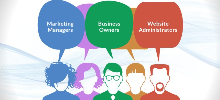
This article is for anyone who is a marketing manager. That could be anything from, the CMO of the company to a marketing intern who has been tasked with finding a new website for a small or medium-size business.
This is also for anyone who is a business owner, so if you own the business and you’re thinking about redesigning your website, this article is definitely for you.
Also, anyone who is a website administrator, so that could be anyone who is in charge of editing or updating the website on a regular basis, this post is for you as well.
This is an article that most other website developers probably don’t want you to read. The reason is that most other web designers basically like to think of themselves as all-powerful wizards with magical powers. And they use complex technical jargon and terminology to intimidate and mystify their clients into thinking that what they do is more complex than it is.
This post will help to de-mystify the process of hiring a local website builder and walk you through what you should be looking for when thinking about hiring a web site designer. So, without further ado here are the six dumbest mistakes.
Mistake #1. Paying Too Little

The way a lot of people think about getting a new website is, they have a certain amount of money and they think, “If I pay less money for a website, I’ll have extra money left over, therefore I win”. And so they’ll go and get a Square Space or a Wix or a Go Daddy website, and they’ll think because they’ve saved money they’re coming out ahead of the deal.

But Warren Buffett, who’s widely considered one of the greatest investors of all time, says that the most important thing when it comes to thinking about money is opportunity-cost.

So, what is opportunity-cost?
Instead of thinking “I have this money, I need a website, I’m going to get a Square Space website, I’m going to save money by getting a Square Space website, therefore I win.
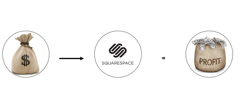
” Opportunity-cost would think, “All right, so I have this money. I can do one of many different things, including getting a Square Space website, a do-it-myself, hire a website builder near me, hiring someone overseas, what have you. And then out of all those decisions, which one will bring me in the most net profit overall?”
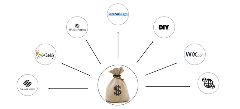
And, that’s really the way you should be thinking about it in terms of opportunity cost. It’s not so much, even your return on investment on a single idea, it’s what’s the best overall net profit on all the different options available? And sometimes when you go the cheap route, you’re really losing a lot in terms of potential net profit.
Another thing people don’t consider when going the cheaper route is what’s the value of your time? Because, when it comes to investing you’re either saving time or you’re saving money. Money buys you time and you have to ask yourself:
“What’s the value of my time?”

The analogy I like to give is Ikea. The reason they’re able to charge so little for their furniture is they effectively pass on much of the work that other furniture manufacturers would do, to their customer.
So, for example, you have to go schlep around the actual furniture at the warehouse because they don’t really have salespeople there. Then you have to go and deliver it to your own house. And then you have to put it together, and those are all things that typically other furniture manufacturers would have employees do.

The truth is, when you’re assembling Ikea furniture, you’re not a professional furniture builder, and therefore the quality and the output is not going to be as good. And that metaphor applies to website design. Most people are not professional digital marketers or designers or understand user personas, or how to get traffic, or any of those things. And so, not only are you using all of your time to build the website but then you’re not getting as high-quality an output as you would as if you just hired someone who did that full time.
Mistake #2. Paying Too Much

This is the exact opposite of mistake #1. Let me start by revealing a dirty little secret when it comes to website design. Most people think, “Oh, I’m going to hire a professional website firm because I want a “real website” As opposed to a Word Press website or something else.” And what most people don’t realize is that all websites are made from the same stuff.

On the front-end it’s all just CSS, HTML, and JavaScript, and I mean, all websites.
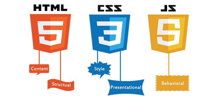
If you go to Apple.com, Facebook.com, Amazon.com, any website on the web, and you look at the source code, it’s just CSS and HTML. The HTML gives it structure, the CSS gives it design, and the JavaScript gives it animation and that’s it.
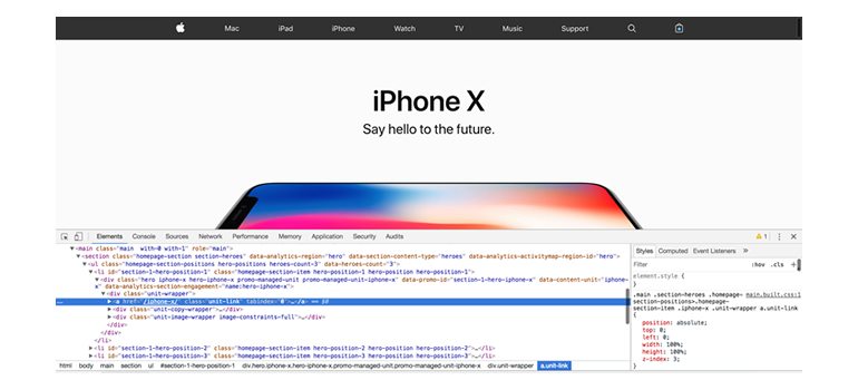
If we look at this $50 template site, it’s made from the same stuff in the source code as Apple.com.
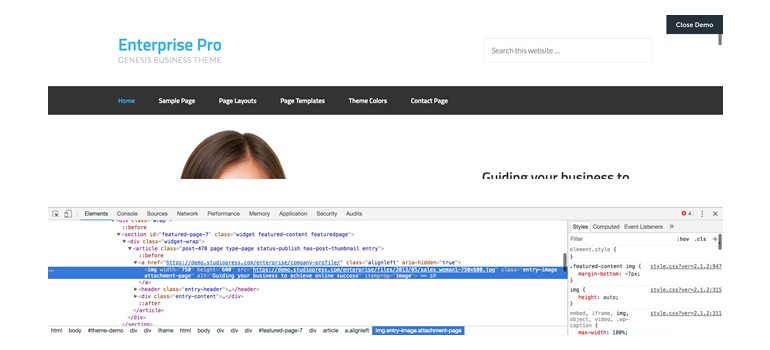
Web Designer Near Me
So, when you work with high-end local web designers, it’s not as though you’re paying for something different. You’re just paying for a higher quality version of the same thing. Someone who knows how to code better, someone who understands design better, hopefully marketing better, and really, that’s what you’re paying for.
A lot of people think they should work with a large agency for their website because they’re going to do a better job. So you’ll go to their office and it’s a beautiful office that looks to be quite expensive in a nice part of town and they have ping pong tables and people are playing and having fun.

And if you’re wondering, “Wow, I wonder how they can afford to have all this nice office space,” well, the price of your website is going towards those things. Right? And, the way it typically works is you will get contacted by a slick salesperson who will sell you on the idea of working with their firm and he seems very polished.
But then, typically what happens is you end up working with a junior level employee who is quite new, and that’s really your day to day contact, the point person that you’ll be dealing with throughout the project.

One thing I would advise people when it comes to choosing a website is to just focus on the result. At the end of the day, it’s, “do you like their work?” Do you like the quality of their portfolio? And trust your own judgment, because basically, most expert opinion is a lie. Let me explain what I mean.
So they’ve done studies with world-class sommeliers who have been blind taste-testing wine and they can’t tell the difference between, the highest scoring wine and regular wine.
They’ve taken world-class violinists and had them blindfolded and test a Stradivarius violin worth millions of dollars which were made 400 years ago versus a modern-day violin, and they can’t tell the difference.
Warren Buffett made a $1 million bet that a regular index fund using the S&P 500 would beat hedge fund managers over a 10 year period, and he won.

So, basically, at the end of the day, just trust your own judgment and don’t be clouded by the aura of someone who claims to be an expert, because generally speaking, it’s not as powerful as you might think.
Mistake #3. Hiring a ‘Designer’ to Build Your Website
So, what do I mean by that? That sounds weird. So, when I say designer, I mean someone who’s strictly an artist, and there’s a lot of those out there. A lot of ‘designers’ are only concerned about the aesthetics of the site. What it looks like, or if its unique, or if it follows the latest website design trends. But at the end of the day they don’t really ‘get it’ when it comes to what the primary purpose of a website is.

And so, let me ask you, what’s the primary purpose of a website?
Is it to look beautiful?
Not really, no. It’s not the primary purpose.
Is it to improve user experience?
Not exactly, no, that’s not the primary purpose.
How about to win awards? Uh-uh, definitely not.
If you’re running a commercial enterprise, the purpose of the website is to make money. And the only thing you should judge a website by is, ‘does it bring in more money?‘ Otherwise, what’s the point of getting it? Right?

And so, most designers don’t understand that.
The way we approach it is marketing plus design.
The way I like to think about a website is, there’s a particular person, and they’re looking for something, and there’s a next step that they want to take.
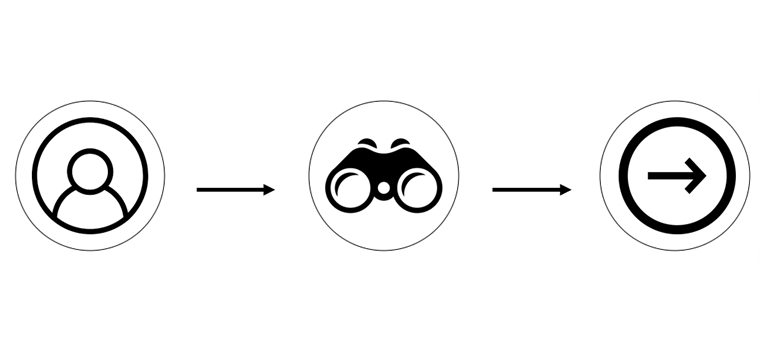
What we do when working with clients is we identify:
Who are the different types of people coming to the site?

What are they looking for?

What’s the next step that they want to take?

Defining those variables is our process for converting leads into customers.
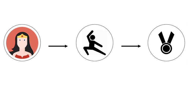
And that’s marketing. We do marketing first and design second.
Mistake #4. Not Getting a CMS
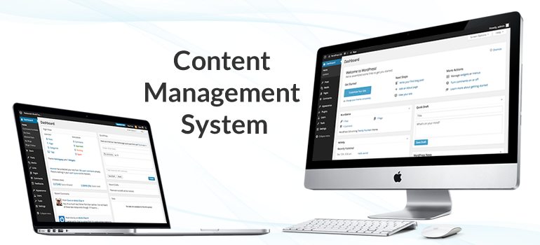
So, what is a CMS? A CMS stands for Content Management System, and it’s essentially a piece of software to manage and update your website. Word Press and Square Space are both a CMS, and there’s a million different CMSs out there. The one thing to note is not all CMSs are the same, even within Word Press.
There’s a concept within business called a phantom deliverable, and a phantom deliverable is something that you as the business give to your customer that they’re not really expecting or they don’t know that they should be expecting it.

One of the phantom deliverables that we give to our clients is the backend of the site. Most people, when they’re buying the website only think about the front-end. They think about its appearance, and they don’t really think about the ease of use or the number of hours or frustration it would take to edit and update the site.
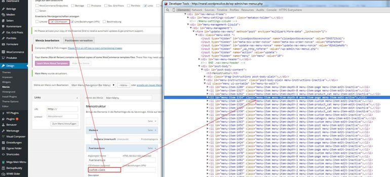
Sometimes you’ll get a site like this on the backend that’s very hard to edit and update. You essentially have to know how to code to be able to do so.
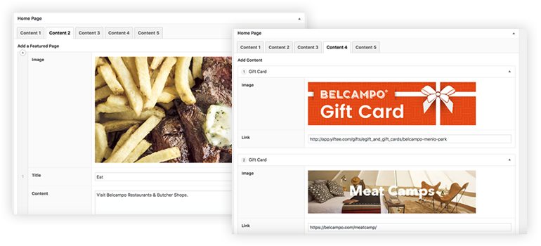
Versus, this is a site from our backend where the image, the title, the description, every little thing is easy to edit and update, just like updating your Facebook profile.
One thing I would advise is to check under the hood of the company that you’re looking at.

By that I mean ask if you can look through the backend of one of their sites to see how easy it is for you to edit and update because that should definitely factor into your decision.
Mistake #5. Not Doing Your Due Diligence
Some basic simple things could be to check out to see if they have any reviews. So look them up on Yelp, Google Reviews, and LinkedIn. See if people are saying nice things about them, or if anyone is saying anything particularly bad.
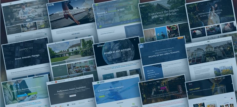
The most important thing is ‘do you like their work?’ We talked about this before, but at the end of the day, that’s what you’re getting. You’re getting the results and so make sure you’re happy with their work.
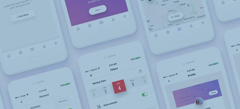
As well as, look at their work on mobile. A lot of people don’t take the time to think about what their site is going to look like on mobile and it’s really simple. Just look at their portfolio sites on your mobile phone.
Another thing is most web designers only list their best sites on their portfolio, but if you want to see, all of their portfolio, here’s a little hack that you can do.
At the bottom of every website that a website design firm makes, they typically have a signature. Ours says “San Francisco Web Design by Thomas Digital”, but it could say “Website by XYZ Media” or whatever.

And so what you’ll do is just take that line of text and go to Google.com, and put in a quotation mark, that line of text, and then another quotation mark, then hit enter.
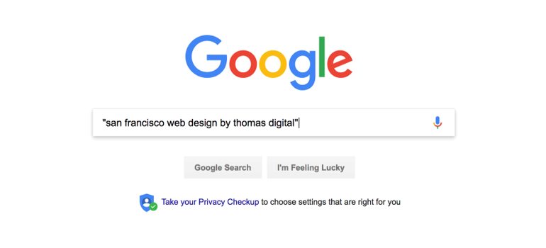
Then, as you’ll see, it shows you all the results that have that exact phrase and that’s typically their entire portfolio.
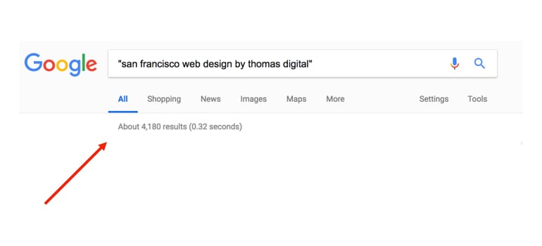
So, that will allow you to see all the work that they’ve done, even if it’s work that they’re not displaying on their own site, and that might be useful to see as well.
Mistake #6. They Don’t Practice What They Preach
Just as you wouldn’t trust an overweight personal trainer or a skinny chef, you should probably never trust a designer with an ugly looking website or an SEO specialist who doesn’t rank well on Google or an “internet marketer” who uses direct outreach to generate leads. And by that I mean, if someone is selling you the idea of getting traffic through Google or Pay Per Click or Social Media, but they’re using cold outreach, like, they’re direct emailing you or they’re using word of mouth to get in contact with you, they’re really not practicing what they preach.

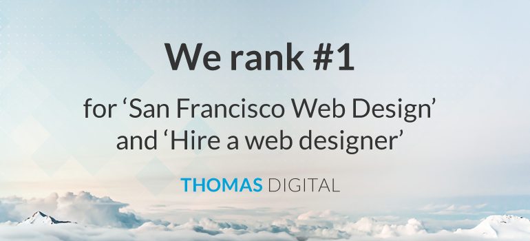
For example, we rank number one on Google for “San Francisco Web Design.”
Read to Hire Someone to Make a Website?
So, if you’ve made it this far, then you’re probably thinking “I need someone to build my website for me.” So, I’d like to make you an offer that you can’t refuse.
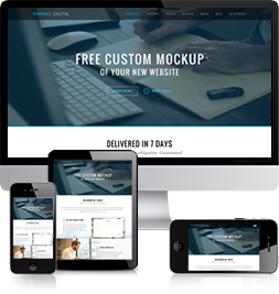
We will design a Free Custom Mockup of your new website before you sign or pay for anything. We create your design in Photoshop, at no cost and with no obligation. There is nothing to sign, and no credit card information is taken. So, if that sounds like something that might be of interest to you, click the link below.
- 76Shares



I designed a Photocrati website. I do not understand coding. It has been a headache. I’m wondering how much you charge to design a new website for my photography and also how much you charge to fix the one I’ve started. Thank you, linda
Hi Linda,
Unfortunately, we don’t do update work on sites that we have not developed.
To view our pricing, please go to our ‘Pricing’ page.
Thanks,
Victor
I would like to design my sight to attract people and make it friendly
We are looking forward to someone to create a website for our firm. Please give me a call. Thanks.
I would like to see a mock-up. Thank you.
You’ve made many good points.
I am interested in a website to help my small business. I am a remodelor in the Portland Brunswick Maine area and I want exposure.
We are thinking of starting a non-profit business, and I like this website because it focuses on the # 1 goald, MONEY.
Thank You,