Increase Website Conversions With the 6 Weapons of Influence

Increase Website Conversions
I’m about to share with you a secret trick I use to help my clients increase website conversions by up to 100% or more.
A lot of people think that Website Design relates mainly to fonts, colors, spacing and imagery.
Design elements are of course important. We take pride in our unique and well-designed portfolio of work.
But the truth is…
Good design is not enough.
You can have a beautifully designed website which follows all the best practices of design that still doesn’t convert nearly as well as it could.
My ‘secret’ comes from a 30-year-old psychology book called Influence, written by Robert Cialdini.
In this book, Dr. Cialdini outlines six weapons of influence, scientifically proven to measurably improve subject compliance.
In this post, I will share with you the six weapons of influence and how we incorporate them into our client’s website redesign.
After reading this article, you might never see a website the same way. You’ll notice these tactics being used on many of the websites you visit every day.
Social Proof

Ever hear the expression ‘monkey see, monkey do’? Well, people are a lot like monkeys.
One study was done with a classroom full of people were all given a form to fill out. Everyone in the room was in on the experiment, and only one person was being observed. The classroom slowly starts filling with smoke, clearly indicating there was a fire in the building. But all the other subjects (in on the experiment) kept filling out the form as though nothing was happening. The subject (the only one not in on the experiment) continues to stay seated filling out the form in spite of obvious concern on their face about the smoke.
The takeaway: People are more likely to go along with the group and do what other people do.
Amazon.com does a great job of using this tactic on their site. Have you ever seen the callout that says: ‘People who bought this item also bought…’? That’s Social Proof
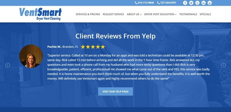
Testimonials are a great way of incorporating Social Proof into your site’s design to help increase website conversions.
Even better is including photos with your testimonials.
People like to see pictures of people like themselves and trust those opinions more than others.
A good strategy is to have a wide range of testimonials across many customer types to give people a better chance to self-identify with one them.
Reciprocity

WalWart founder San Walton refused to allow his purchasing agents to take so much as a stick of gum from potential vendors. He must have known about the power of Reciprocity.
In the book Influence, Cialdini tells the story of how Hari Krishnas would go up to tourists and pin a flower on their lapel. Offering the flower as a gift. They would then ask the tourist for donation to their church. Because the tourist had just received a flower, they felt obliged to give them a donation in return. This is the power of reciprocity in action.
One of the most powerful words used in marketing is FREE.
If you can give something away for free that goes a long way in triggering the reciprocity bias.
Giving away valuable information in the form of an article or whitepaper can also trigger the reciprocity bias but not as strongly.
Authority

People are more likely to go along with the instructions given by an authority figure.
A prime example of this is the famous Milgram experiment.
Student volunteers were asked to participate in an experiment given by a professor in a lab coat. The professor instructed the student to give a helpless victim repeated electrical shocks. Many of these students shocked the helpless victim until they were completely unresponsive and seemed to be dead.
The student volunteers weren’t sadists. In fact, many of them were in tears as they were giving the shocks. But they continued obeying the professor because they thought of him as an authority figure.
The point of the study was to show that people will do terrible things they would not normally do if they thought they were obeying the instructions of an authority figure.
So how can we use this frightening bias in our design to increase website conversions?
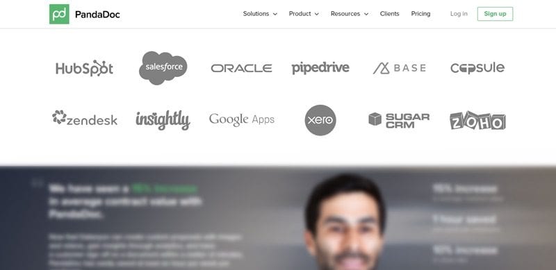
Using logos from recognized and accredited third parties is a great way of demonstrating authority on your website. This can include business organizations such as the Better Business Bureau, or press coverage from recognized media authorities in your industry.
Third party logos are a great way of activating the authority bias which will help increase website conversions.
Commitment and Consistency
People have an innate need to stay consistent with how they perceive their identity and behavior.
In one study researchers went door to door asking homeowners if they would be willing to put a giant sign on their front lawn promoting driver safety; less than 10% of homeowners complied.
Then with the second group of homeowners, researchers asked if they would be willing to put a small flag on their front lawn promoting driver safety and about 80% of homeowners complied.
The researcher then went back to the second group that had allowed having small flags on their lawn and asked them if they would allow placing a giant sign on their front lawn promoting driver safety and a whopping 30% of homeowners now complied with the request.
The act of asking for a small request first increased compliance of the larger request by 300%.
When it comes to website design the mistake most people make is asking for too much up front.
The purpose of a website is NOT to make a sale. The purpose of a website is to get a visitor to make one small action, such as learning more about your product or service. Then to take another action such as filling out an inquiry form or downloading some Free Report. In any case, they key is asking for one small request, then another building on the Commitment and Consistency bias until you make a sale. This approach will go a long way towards increasing website conversions.
Liking
People have a tendency to do more for people they like than they would for people they don’t.
Seems pretty obvious but that doesn’t take away from the fact that it is a powerful and effective tool for influence.
People like people that are like them. They also like people that are positive and upbeat.
One way to use this bias to increase website conversions is to include images that are representative of the user types you are trying to target. We also encourage our clients to include photos of themselves, especially in fun spontaneous images that help show a more human side to them which helps to trigger the liking bias.
Scarcity
People want what they can’t have. The scarcity bias is a powerful weapon of influence that triggers people’s innate need for loss aversion.
In one study done job seekers were given the option to interview at two firms one with many job openings and one with just a few job openings. The subjects all perceived the company with fewer job openings available as a better firm even though no other information about the company was given.
Amazon does a great job of using the scarcity bias to increase conversions in their website design. If you ever noticed the little box that says (only three items left) that is them triggering the scarcity bias.
Conclusion
As you can see, there is a lot more that goes into it than just the fonts and colors to increase website conversions. By having an understanding these powerful psychological triggers, you can help increase your website’s conversions by many times. The next time you’re on your competitor’s website or your own, try to check off how many of the weapons of influence are being used and how you might be able to use one of these tactics to increase your site’s overall conversions.
Want to see these concepts brought to life in your own website’s design? We will put together a mockup of your new site for Free before you sign or pay for anything. See for yourself how we would implement the six weapons in Influence into your own website’s design. Read below to learn more.

FREE MOCKUP
OF YOUR NEW WEBSITE
If you’re looking for a new website, we’d like to make you an offer you can’t refuse.
We will design a Custom Mockup of your new website for Free, before you sign or pay anything.
If you like it, we can move forward working together.
If not, there are no hard feelings and no further obligations.


